|
In January of 2018, the manager of a small hotel in Dublin decided to check his email. Paul Stenson recounts the moment vividly in his blog; he went through a “whirlwind of emotions” when a social media influencer emailed him to offer an exchange of “exposure” on her platform for free accommodations for herself and her partner for four days, over Valentines Day weekend. The influencer held fast to flattery, calling the hotel “stunning” when the manger himself classifies it as a “budget lodge.” Instead of emailing her back directly, he decided instead to post a scathing and very public response on Facebook. It was brutal. He claimed that she had no self-esteem or dignity, shedding a whole new light on being humbled by humiliation. He asked her directly who would pay the salaries of the employees that were taking care of her if she herself was staying for free. He posted screenshots of her email with her information partially blurred out and, subsequently, initiated a rallying cry for all of the internet.
This situation calls to mind that of Adria Richards. When attending a programming conference, she overheard two men making a joke about “dongles”—this pun worked both as a computer joke, but also as an amateurish penis joke. Like Paul Stenson, she chose to avoid a direct conversation with her offenders and went straight to the internet. She championed a crusade to publicly shame the two men behind her, claiming that they were offensive and insensitive to the female programmers in attendance. But when one of these men lost their job, the public shaming turned on her. Paul Stenson faced similar backlash when Elle Darby explained in a Youtube video that she had been exposed, and that her information had not been completely blurred out. She discussed how the exposure left her feeling horrible. She pointed out that a hotel or restaurant would not be able to exchange goods for advertisement on a commercial or billboard and outlined a business transaction that is becoming increasingly common. This video fueled the controversy and bloggers flocked to Trip Advisor to leave horrible reviews of the hotel in solidarity with the influencer. Paul Stenson stoked the flames. He explains in his blog that he was receiving millions of dollars in free advertisement from the scandal, yet he was angry that she was receiving more. He responded with vitriol. He outlined a plan to divide support into two groups, and essentially, continuously stir the pot to receive more notoriety. This is problematic: he had a fundamental issue with the morality and dignity of people who make their money via social media. He raised crucial questions about the implications of people being paid to review products and services, yet opportunistically manipulates the situation flagrantly for his own gain. Ultimately, the issue on both sides is an ignorance of context and audience. When Elle Darby sent her email to Paul Stenson, she clearly had not done her research. The hotel was never supposed to be “stunning” as she so described it, and her lack of awareness of the financial ramifications of her request were clear. She reached out of her social milieu without educating herself on the social norms and necessities of everyday life in Dublin. She approached a hole-in-the-wall establishment run by simple people in the same way she might approach a swanky up-and-coming spot in London. Conversely, Paul Stenson seems to lack an understanding of the ways in which many social media influencers live. He misunderstood her context, lumping her in with “entitled vegans” and “people with make-believe illnesses like gluten intolerance.” He interpreted the email that she sent him (alongside many other hotels in the area) as a personal attack, rather than a fairly standard business proposal. Like Adria, he rushed to the internet to unleash his fury on the “petulant bloggers” before considering that this was standard operating procedure in many places around the world. This mutual ignorance and misunderstanding of audience and context led to a breakdown in communication, wherein there seems to be little willingness to mend. Elle Darby first disabled comments on her teary and heavily edited response video, and then deleted it altogether. Paul Stenson eventually banned all bloggers from his café and published a tell-all in his blog. Its rich with condescending commentary and assertions. Again, Hank’s and Adria’s story echoes throughout this example when he admits that he is fearful of even speaking to women in his office, just as Stenson abhors the concept of feeding a blogger. Instead of an opportunity, we here find a closing, a schism that is not easily repaired. There seems to me to be a way to negotiate a conversation such as this, but only where there is willingness and accountability on both sides. But in it, we can come to see the representation of many opposing forces that play a prominent role in our lives: that of old and young, republican and democrat, man and woman. We can come to understand this as a horrible example of what is to come from ignorance of who we are talking to and where they are coming from. It also makes clear that in order to move forward we need to exemplify a willingness to ask for and listen genuinely to the answers to these questions.
0 Comments
For this design, I was aiming for something intuitive and simplistic, while still holding true to the spirit of The Tempest. The **six large frames towards the bottom of the screen would hold pictures for each of the category pages. The small boxes under that would work as a navigation bar. Ideally, I would like to implement a feature like others we have seen in archives where when you mouse over the image and a short sentence would come up describing each category. I intend to use the font "Centaur," with the all caps for the navigation bar, in white letters to provide some contrast with the background at the bottom. I wanted everything to be aligned in a simplistic way to make things easy to find and the minimalist approach is appropriate for the modern and chic vibe that Nashville tries to embody. I chose that font because I felt like it portrayed distinction, while looking a little majestic. Given the strong themes of forgiveness and whimsy underlying the work, I wanted something that looked like it came out of an old story book. I used this particular gradient swatch as my background because I felt like it appropriately portrayed depth of the story, while the color recalls the shipwreck in the beginning. My logo was important to the over all design of the website because I really felt like it encapsulated the many aspects of this particular work that we are trying to preserve. I decorated a cloak to look like the one that Prospero wears—a sea foam green flowing robe with book pages lining the inside. I did this for several reasons; it was a bold and interesting costume choice that capture the other bold and interesting choices that the director made, it embodied both literature and magic, and the image itself forms a kind of embrace. The notion of embrace or gathering was crucial, as it is at the heart both of The Tempest and the act of archiving. **I realize now that the frames for photos don't appear in the JPEG, but they are in the original work in InDesign. The logo will go in the large rectangle at the top. 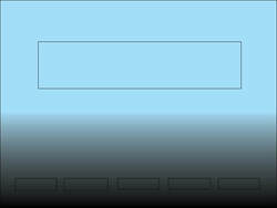
Putting this site together was more of a challenge than I expected. Confidence and excitement waned as I realized how little knowledge I had of the material I was working with. I used the template I had from the HTML/CSS quiz, and without that I would likely have been lost. Initially, I was terrified to delete anything; I didn’t know what I would need or if I could recreate it. There was simply too much to look at, so I started taking things out to see what would happen. I looked at previous students’ sites and found a lot of guidance. I struggled getting a border to go around the body of only one of my pages without affecting the others, and eventually had to accept defeat. I also struggled with how to get images precisely where and how I wanted them. I used a resizing website to size the images appropriately, but I couldn’t get the background transparent for the ones I wanted to use on my homepage. I’m not sure how I got it to work, it came down to perseverance. The moment I saw the “moth moon” picture in its current place was a victorious one indeed. I had low standards when it came to the look of the site. I knew I didn’t have the time or the knowledge to create something cutting edge. Something visually pleasing but practical was my highest goal. However, I was anticipating having more time to showcase more aspects of myself. I wanted a page for my writing, my thinking, my dog. Maybe some recipes. My biggest limitation (other than persistent confusion on the mechanics of the “wrapper”) was truly a lack of time. What I know now is that it would have realistically taken me the rest of the semester to achieve something like what I envisioned. The modes I aimed for were the ones that seem the easiest to do well. Visually, I used pictures that would draw in the eye and look interesting. On the home page I used the “moth moon image” to reinforce the idea of dreams present in the title and icon. These elements paired with the font ideally invited the reader into my work with a similarly whimsical mindset. I used the spatial mode in the placement of my text. By having everything aligned to the center, I aimed to draw attention to my words. By using padding and margins I tried to create space underneath my text to avoid the impression that what I wanted to say was hiding at the bottom of the page, and therefore less was important. The design strategies that I most consciously aimed for were contrast and proximity. By using a light background color and a dark color for my header, I intended to accentuate the playful flow of the font while also emphasizing the presence and impulsive qualities of titles that echo of “now.” I also used images that created an interesting contrast with the surrounding elements. Particularly in the “Now Watching” page, I chose an image from “Twin Peaks” that evoked a different tone. Dale Cooper in his dark and bureaucratic suit, the black and white floors of such structure, and the rich red of the curtain of the Black Lodge worked together to provide a contrast of sharp lines and deep colors, while supporting the dream theme (is it too late to rename my site?) that I tried to embody. I used proximity to ensure my site was easy to use and made sense. Placing the brief introductory text about the navigation bar took a little extra time but was a necessity. Otherwise, the phrases in the navigation bar would appear disembodied and incomplete and would give the impression of meaninglessness and distraction to the reader. Ultimately, this was a delightfully frustrating and exhausting victory. I look forward to an opportunity to play with these skills when I can do so leisurely.
|
AuthorWrite something about yourself. No need to be fancy, just an overview. ArchivesCategories |
||||
 RSS Feed
